What Covers May Come
Published August 2023
By Nathan Gunter | 13 min read
My first day at Oklahoma Today was August 10, 2011. A few days after I started, I got to experience my first Preview Copy Day, which is when the first batch of issues shows up from the printing house. It’s also, I later learned, the sign that the issue has dropped in the mail and is on its way to subscribers.
That day in 2011, I got to see some of the first copies of the amazing Country Music Issue my new colleagues had spent the summer putting together. Because the question of what person to put on the cover of a Country Music Issue of Oklahoma’s official state magazine is a Kobayashi Maru of epic proportions, the staff decided to print not one but six covers, each featuring one of our state’s country music legends:
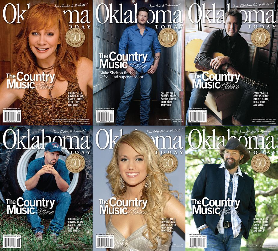
Our Country Music Issue in 2011 featured six collectible covers.
It’s now twelve years later (and a few days’ change), and I’m sitting here again on Preview Copy Day, having just enjoyed my first flip through our new September/October 2023 issue, the one we’re calling “Oklahoma After Dark.” On its cover, it features a gorgeous shot of a Whimsical Bees Knees cocktail from Valkyrie in Tulsa, shot by our amazing staff photographer Lori Duckworth:
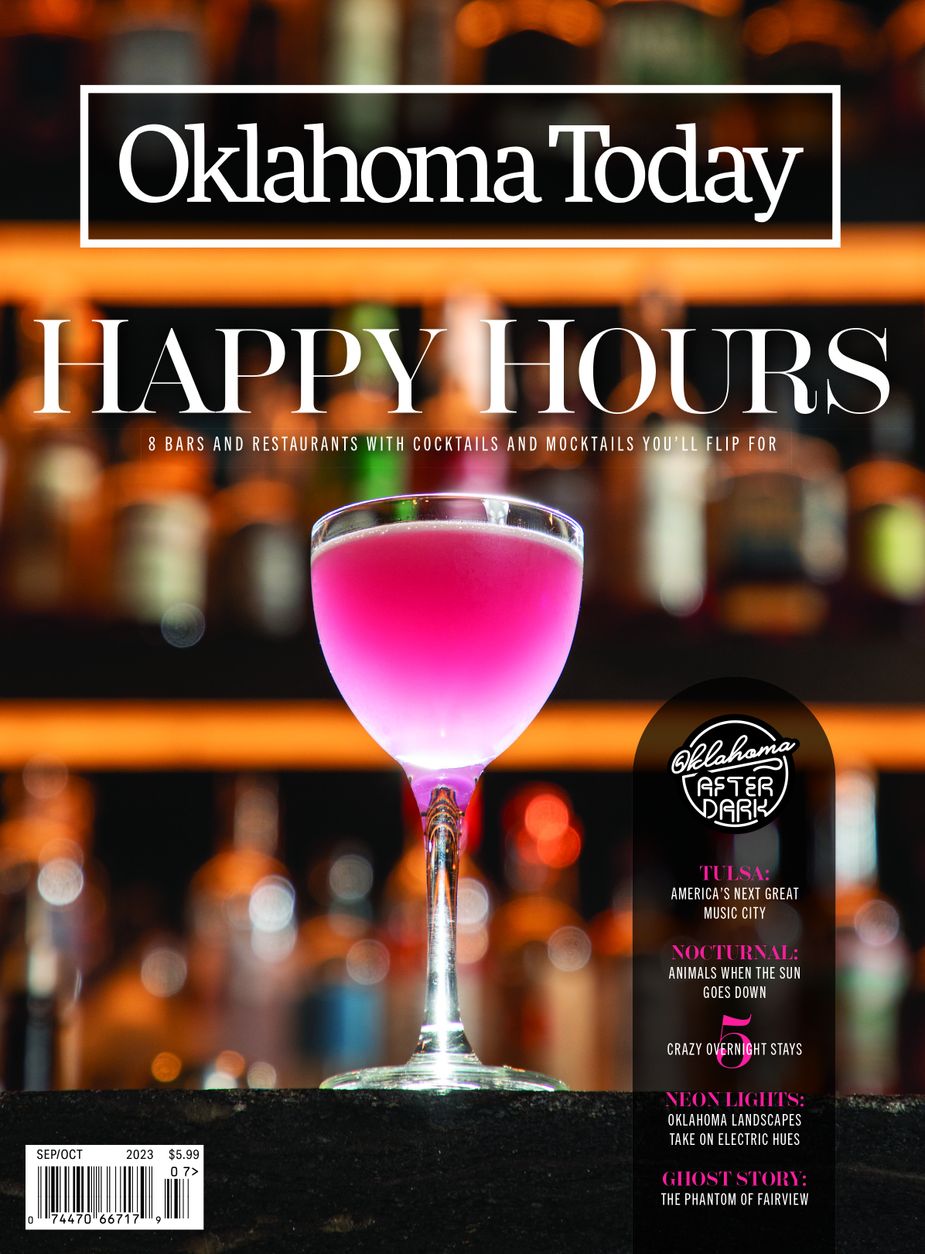
Our next cover.
But the road to getting there was a long and winding one, not least because our cover feature—“Cocktail Couture,” in which Greg Elwell goes in search of some of the state’s most exciting cocktails and mocktails—was rich with Lori’s gorgeous photography. It was a nearly impossible task to decide to choose the image above for our cover when we had other options like these:
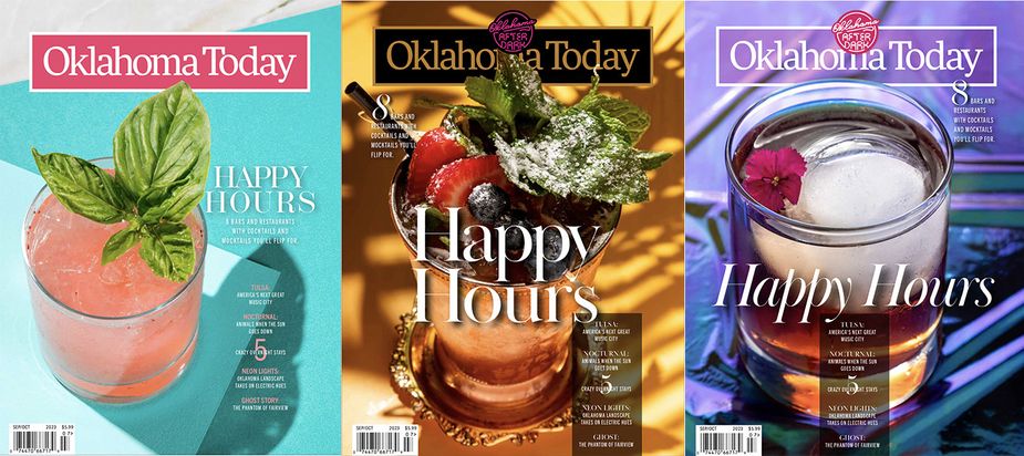
A few of the also-rans for our current issue, all with photos by Lori Duckworth.
Honestly, the one on the left may very well have won out had the issue been, say, released in the summer or not been titled “Oklahoma After Dark.” It’s an absolutely stunning shot that deserves to shine from the newsstands in high-gloss print, but them’s the breaks. But it’s got me thinking about all the covers we’ve created but not published over the years, the ones no one ever sees.
My first issue as an editor, November/December 2011, came out with a gorgeous shot of the Survivor Tree on its cover, but that decision was excruciating, as another version of that same cover had a beautiful image of the Clear Creek Monastery by Tulsa photographer Shane Brown. Unfortunately, I was unable to find an image of that lost Clear Creek concept, and anyway, I was proud for the Survivor Tree to post up on my first-ever issue. But here are the covers of the first six issues I worked on:
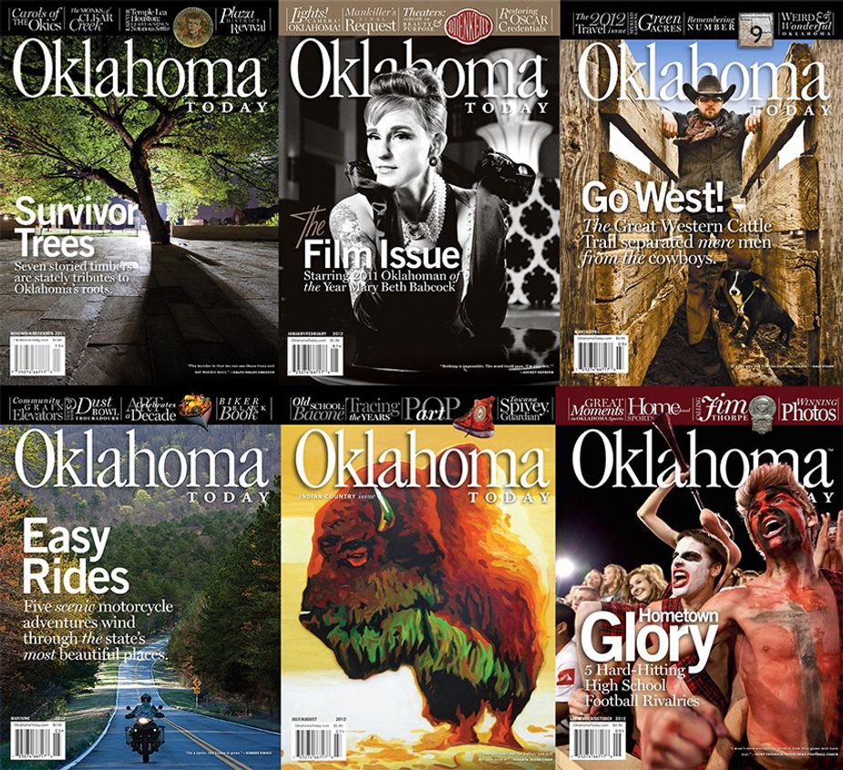
My first year (six covers) as an editor. Each of these has a fairly wild and/or hilarious story to go with it in one way or another, and I can still picture all the versions of these covers that didn’t go live. That March/April cover with the cowboy is, nearly a dozen years later, still one of my favorites from my whole time here.
A dozen years later, and the question of covers still lingers over every issue. Creating a magazine cover is some alchemical combination of art, science, and marketing that’s tough to nail down. Like all creative endeavors, it starts with random ideas. In researching this blog, I went back through years of my emails from our art director, the Genius Wizard we call Steven Walker, to find where he’d sent me slates of cover concepts—some his, some mine, some our staff’s—to consider as a way of kicking off the process. In going back through some of these, I found cover images that whiffed hard. I also found a few that were so good, I can’t imagine what we were thinking making the choices we did.
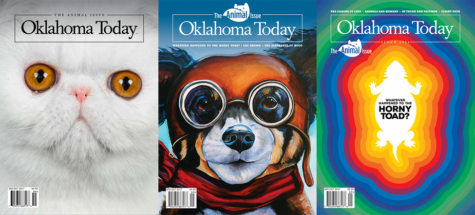
Three options for our September/October 2017 cover; the final published product is in the center, featuring art by Matt Moffett of Tulsa.
For example, in this image above, the cover we published—with amazing artwork by artist Matt Moffett of Tulsa—is in the middle, flanked by two options we rejected. And while I’m a huge fan of Matt’s art and love this cover, I genuinely can’t see a reason why we didn’t choose the horned toad cover. Oklahomans love those little things! And while I cracked up laughing the first time I saw the cat cover on the left, it looked a little bit too much like The Monster Book of Monsters for me to go with it. Its reasoning is lost to time, but the final choice stands as one I’m proud of.
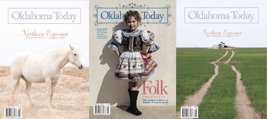
Three options for our September/October 2018 cover. The final published cover is in the center with a photograph by David Joshua Jennings.
Sometimes, the embarrassment of riches that is Oklahoma Today photography can create a problem, as in this slate of potential covers from September/October 2018. Our final draft, with a photo by David Joshua Jennings, is flanked by two unbelievable images from Oklahoma City photographer Eyakem Gulilat, whose shots of the Panhandle were a gorgeous addition to the issue. And as much as I love the little girl in the Czech costume, the horse was everyone's favorite from an aesthetic perspective. Unfortunately, our January issue earlier that year also had featured a photo of a horse—two in one year seemed a little much, despite what a gorgeous image that is. So I stand by our decision—that little girl is darn cute, after all, and the Czech Festival in Yukon is a heck of a great event (that’s happening October 7 this year).
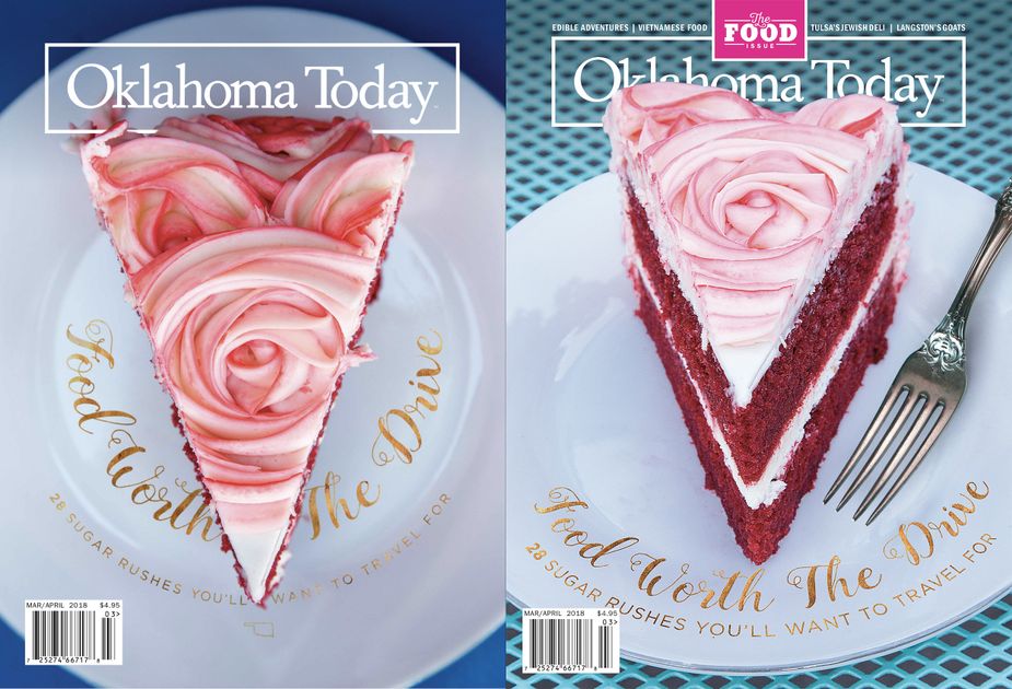
Two cakes, two covers with subtle but important changes. The published cover is on the right; both photographs are by Lori Duckworth.
No matter what, a cover always is a collaborative effort. For our March/April cover in 2018, we shot this gorgeous piece of cake at the Coffee House on Cherry Street in Tulsa. The original draft of the cover is on the left—a draft that some of our colleagues told us made it difficult to tell they were looking at a piece of cake and not, say, a piece of art. So Lori went back to Tulsa and shot it at an angle, resulting in the gorgeous image on the right. But the fork in the shot looked a little off, so the feedback came back that we should change it. Cut to me and Megan, twenty-four hours before the issue is due to the printer, driving up to Quail Creek to visit my friend Cherry Kay Clifford. Cherry Kay is my friend K.C.’s mom, and she has the most extensive collection of dishes, china, and gorgeous cutlery of anyone I’ve ever known—so much so that her garage has been converted into a storage space to house all of it. (She calls it “Chinatown.”) Cherry Kay let us look through her many forks, pick one out, and use it in our final cover. It was an adventure in stressful last-minute insanity, but I’m proud of the finished product.
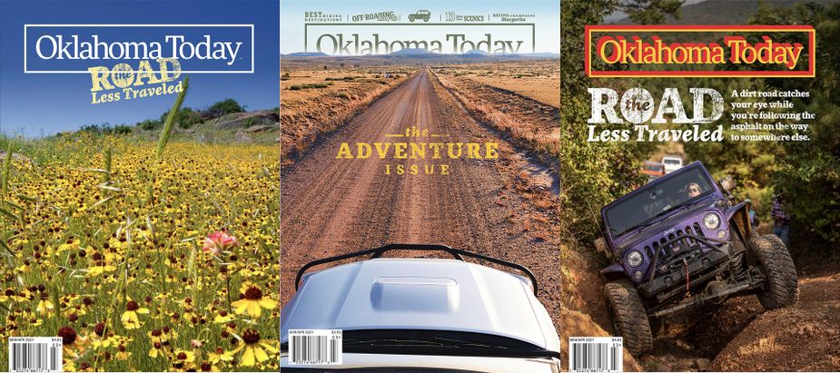
Sometimes, you just know when you’ve got it—in this case, the center cover with a photo by Susan Dragoo was a pretty easy choice in the end.
And sometimes, it’s not that tough in the final reckoning, as in the case of our March/April 2021 cover. When we saw the Panhandle shot by Susan Dragoo in the center cover here, we knew we had our main image. I mean—even the most committed couch potato would want to see what adventure lies down that road. We tried so many other options, but as you can see, none of them sang the way that one did.
In the end, what really matters about our covers—what really matters about everything we do—is you, the reader, so we try to create covers that appeal to you, that call to you, that make you want to open the pages, look inside, and sample the Oklahoma goodness for yourself. Maybe you’ll see this issue’s cover and make it a point to visit Valkyrie the next time you’re in Tulsa’s Arts District (it’s worth it; that place is amazing). Or if cocktails aren’t your thing, we hope you’ll open the issue anyway—we try to make sure each one has something for everybody to enjoy. Our next cover, coming in November/December, features a piece of artwork by Osage artist Addie Roanhorse that will accompany our feature on the film Killers of the Flower Moon (on which Addie was an art director). Coming up in 2024, I already know what I want to do for our first three covers.
In the end, creating a great magazine cover is an attempt to thread a very small needle—one that looks gorgeous and timeless, calls to uninitiated readers to take a look and subscribers to get excited upon receiving it, and activates some kind of participation—a trip, a Google search, a razoo through TravelOK.com, a call to a friend to say, “Oh my gosh, I know what we’re doing this weekend.” It’s a tough task, but it’s ultimately one we’re excited to take on in the name of sharing all the goodness our state has to offer. We hope you continue to like them for years to come—and if you want to take a voyage through all of our covers going back to 1956, you can do that right here. Shoot me an email at nathan.gunter@TravelOK.com to let me know your favorites.
"Tuesday Trivia: August 15, 2023"
"The Oklahoma Today Podcast, August 21, 2023"
You May Like
Weekly Events Calendar: April 14-20, 2025
This week in Oklahoma: The next-best Beatles experience in Duncan; an Easter extravaganza in Foss; and an activity that truly rocks in Tu...
This week in Oklahoma: The next-best Beatles experience in Duncan; an Easter extravaganza in Foss; and an activity that truly rocks in Tulsa.
Oklahoma Today Podcast: April 14, 2025
30 years after the 1995 bombing of the Alfred P. Murrah federal building in downtown Oklahoma City, OKC Fire Chief Richard Kelley joins t...
30 years after the 1995 bombing of the Alfred P. Murrah federal building in downtown Oklahoma City, OKC Fire Chief Richard Kelley joins the show to talk about his experience as a first responder th...
Some Tips for Introducing First-Time Visitors to OKC
Oklahoma City residents know there is a lot about the city to show off to visitors. But where to begin? Here are a few ideas for getting ...
Oklahoma City residents know there is a lot about the city to show off to visitors. But where to begin? Here are a few ideas for getting your friends to fall in love with OKC.


